Friday, 23 April 2010

College Magazine Contents Page


This is my ICT draft of my contents page for my college magazine.

College Magazine


This is my front cover for my college magazine. I used a colourful boarder around the page so that my front cover stands out. I also used the wyke logo at the top of the page as the college is called wyke and so that the reader knows which college my magazine is based on. I also put the date on so the reader knows when the magazine was released. I also put a bar code at the bottom as every magazine has one of these.

Friday, 26 March 2010

Final Attempt At My Music Magazine


This is my second attempt at making my music magazine.

I think this picture stands out more than my other picture. Also i think the text is bright and bold which stands out to readers. The colours i used were red, blue and yellow, i think these colours work well together. I used a yellow outer glow to make my text brighter so it stands out to the reader. The audience for my music magazine is young teenagers from the age of 14-20. My music magazine is a type of hip-hop genre. To make people want to buy my magazine i have included 20 free music downloads as this will attract people to buy my magazine. My head mast text stands out so readers know what my magazine is called, i also included the actual name of my magazine so readers know what DNM stands for. I chose this picture as my front cover image because its bright and stands out which is good because then people will buy my magazine. My magazine is for males and females. I decided to relate my magazine to new bands that have been made because no other music magazine does this and that is why i called it discover new music. I decided to include top 10 music reviews because lots of people like to see what music has been rated the best. I also decided to put a Daisy Dares You special as this is a real band that has just come out and it fits in with my new music theme.

Thursday, 25 March 2010

Evaluation

The Brief
For my media coursework I had to create a front cover for a music magazine and also a contents page and a double page spread. All my images had to be original photographs which I took and I had to make my products from scratch. I used Adobe Photoshop for my front cover and my contents page and I also used Photoshop to edit my two picture’s on my double page spread. I used Microsoft Publisher to create my double page spread as it was easier to do than doing it on Photoshop. I also did three ICT drafts, I did a draft for my front cover, contents page and my double page spread, I did these drafts on Microsoft Publisher just so I could see where I could put certain things such as where I could put my cover lines on my front cover. I have finished all my planning, research and creating and I can now evaluate all of my work.

I started off by researching three different front covers of music magazine's to get idea's of how I could create a really good front cover I also looked at three different contents page's to get an idea of how I could do my own contents page, I looked at Q magazine and two different NME Magazine contents page's. I also researched double page spreads and evaluated three of them, this helped me create my own products as I got plenty of idea's from them and I could also see what I think worked well and what didn't work or fit in with my drafts and planning. I did a textual analysis of everything from the three front covers to the three double page spread's.

I have used the main conventions that music magazines use such as head masts, cover lines, images, the date, bar codes etc. I decided that my target audience for my music magazine would be young adults from the age of 16 to above. Also my genre for my magazine is Pop, I did a draft of how I wanted my front cover to look and I needed an image of a young girl looking like a new pop star. I chose my model to wear a black sequin dress so that when I took the photograph the sequins would sparkle and it would work well for my front cover. I edited my image on Photoshop to make my image look much more brighter to make my front cover appeal to readers. The image is the most important part of the front cover as if the image doesn't look good it's not very likely that it will catch people's attention and make much money. My image also shows my target audience as my artist is a young adult and you can tell this from my photograph. My front cover challenges forms of conventions of real media products as my front cover has a main image of the artist that is most focussed in the magazine. Also I have included mastheads which is the initials of the name of my magazine and I have also included what the initials stand for so that the readers know what my magazine is actually called. I chose to use the colour red for my masthead as the colour red stands out which will make my reader realise what my music magazine is called. I also have the dateline at the top right hand side of the page so the reader knows when the magazine came out. I also put a barcode on my front cover, I chose to place my bar code at the bottom of the page as it is not very important to the reader. I also included the price at the bottom of the page and I put it in a blue colour so that readers can clearly see how much my magazine costs. My colour scheme consists of red, yellow and blue, I chose these colours as they work well together and they also stand out which will catch reader's attention. I have realised that cover lines are one of the most important things on a front cover as this tells the reader some of the things that are included in the magazine. If the cover lines are not very interesting it will not appeal to people and they would not buy my magazine. The colour scheme that I used for my cover lines are red writing with a yellow glow around it, I think this worked well as the text stands out to appeal to readers and the colours work well together.

On my contents page, I decided to use a full image of a speaker as I think it works well and the image I took is very bright and stands out and it also relates to music. I noticed on other contents pages that a lot of them include a "subscribe today and save money" I decided to include this on my contents page as this will appeal to reader's and it will also make profit for my magazine. I included Regulars and Features on my contents page. The colour scheme for my contents page is blue, red and white. These colours work well together as my background image is quite dark and the colours I chose stand out. I included Regulars so that reader's know what is in every issue of my magazine such as fan pages and music reviews. I also included Features and listed some pages of what is included in my magazine. The main story is "Jess Hunt Talks Exclusively" so I decided to put this at the top of my list of page's as this is the main focus of my magazine.

My double page spread consists of two medium shot images of my main artist with a textual story. My head mast continues on to the right hand side of the page as well as the left hand side of the page. I decided to make my main artist's name italic as it stands out to the reader and I also put the name of my music magazine in the colour red as on my front cover the name of my music magazine is red. On my double page spread I decided that my colour scheme would consist of red, black and blue. I wanted to keep the colour scheme minimal as my photograph is colourful. I kept my textual story on the left hand side of the page as I didn't want it to go on to my photograph. I have also used a small photo of my artist to break the text up so it doesn't look so long. I have also used a line from my story to highlight in a circular box which also breaks up my story.The two main programs I used were Adobe Photoshop and Microsoft Publisher. I used Adobe Photoshop to create my front cover and my contents page, this was so I could edit my pictures to make them look the best they could. For my double page spread, I used Photoshop to edit my two pictures on my double page and I used Microsoft Publisher to produce my textual story as it was easier to do on publisher because I am more used to Publisher than Photoshop and also Photoshop is more to do with editing photos than writing a textual story. All my images used were taken on a digital camera which were then edited on Photoshop.

The main way which my music products represents social groups is by the mis-en scene which is the main image of a young girl. From my image you can tell that my main social group is of a younger generation. My model was dressed in a party like black sequinned dress which is very fashionable to younger generations and also the way my model is dress helps to show the type of social group I am trying to target.

The type of institution which may distribute my music products is IPC (international publishing company) . IPC are one of the United Kingdom's leading consumer and magazine and digital publishers which sells over 350 million copies of portfolios a year. The main reason I think that IPC would fit best for my products is because IPC also distribute NME magazine which is a very popular and well known music magazine. IPC have made NME one of the most popular music magazine's in the United Kingdom which makes it easy to buy because they are sold in most newsagents and shops which will make my product easily available.

The target audience for my music products are young adults, mainly females as pop magazines are mainly bought by females as a lot of pop artists are females such as Ke$ha, Rihanna and Lady Gaga and many more. I would say that the range age for my music products is from 16-25 as I think this age range would enjoy my magazine as the features in my magazine are focussed for younger generations. The main people and audience would be students as a lot of students have an interest in music and may be influenced by artists.First of all I wanted to make it clear that I wanted to attract a younger generation by using a young female model, I looked at other pop music magazines and they mostly featured female models. I also attracted my audience by my colour scheme, I used bright colours as younger generations like bright colours instead of having dull and boring colours such a black/grey.

From the process of constructing my product I have learnt that technologies are a big part in creating a good product because if you do not know how to work a program properly such as Photoshop, images and the way the product looks may not look very good if you cannot use the program properly. I had never used Photoshop before creating my music magazine, I found it very difficult to start with but after a while I played about with some of the bottoms and I feel I have a good understanding of how to work Photoshop quite well. Also it would not be possible to create a good product without the internet, as I did most of my research online and without the internet it would not have been possible to research as much as I did. I also used a digital camera, without a camera my image would not have been created. Before taking a photograph you need to know what type of shot you want and how you want it to look. Whilst creating my products I have learnt that technologies are very important when constructing a music product as it is very technical.

The main things I have learnt is that you always need to look back at your drafts to see how you are going to create your products and you also need to keep thinking about your target audience and how I can get my products to appeal to my target audience. Also taking time in doing research and planning is very important as you can look back and refer to how you was going to create your products.Overall I have found creating my music products very enjoyable and it is something I would like to do again. I also found it quite stressful as I did not have very good time management and I felt rushed near the end of the dead line. If I was to do this again, I would make a plan of what I needed to finish by a certain time so I wasn't rushing my work. I would say that the best product I have produced is my front cover, I spent a lot of time and effort trying to improve my front cover and I think my image works really well and I love the brightness of it.

Questionnaire Feedback

I asked 5 people to do a questionnaire about my front cover of my music magazine. These are the results :

What genre do you think my magazine is?
Indie 0

R & B 0
Hip Hop 0
Pop 5

What would you say is the age range of my magazine?

10-14 1

16-18 4
18-21 0
21+ 0

Would you say the colours i used work well?

Yes 5

No 0

Is the name of my music magazine suitbable?

Yes 5

No 0

Does my image represent that my magazine is a music magazine?

Yes 4

No 1

Overall would you say my front cover is:

Very Good 4

Good 1
Okay 0
Not very Good 0
Rubbish 0

Final Contents Page


This is my final contents page. I have two head masts, I have the initials of the name of my music magazine which is in red as on my front cover the text is in read, so I thought I would carry the colour on to my contents page. I also have "contents" in bold white writing as this tells my reader that this is my contents page.
I have also included the date of my magazine at the top right hand side of the page.
I included Features and Regulars. In my Regulars I have every issue things such as Fan Pages and Music Reviews etc.
Also on my Features I have listed story's which are included in my magazine. I have put the main story of my magazine at the top of the page list.
I have included a "subscribe today" as this would appeal to readers as they get to save money and this would make more profit for my magazine.

Final Double Page Spread


This is my final double page spread.
I have my main image of my artist on the right hand side of the page. My mast head is at the top of the page and carry's on on to the right hand side of the page.
I have a subheading under my mast head of a quote from which my artist said. I have text on the left hand side of the page and I also have a smaller image of my artist with text above and beneath it to break the text up so it doesn't look like a lot to read. I think my double pagre spread turned out quite well, the best thing I think is my main image as the image is very bright and it stands out.

Tuesday, 23 March 2010

Front Cover Draft


This is my ICT draft for my front cover.
I have the date on the right hand side of the page. I have my main image as the background with 3 cover lines on the right hand side of the page. I have the masthead at the top of the left hand side of the name of my music magazine.
I also have another cover line at the bottom of my front cover.

Double Page Spread ICT


This is my ICT draft for my double page spread.

I have a mast head at the top of the page which carry's on on to the next page.

I also have an image of my artist on the right hand side of the page which takes up the full page.

I have a subheading on the left page above my text. My text is on the left hand side of the page, i also have another image of my artist which has text at the top and at the bottom.

Contents Page ICT Draft


This is my ICT draft for my contents page.
I have a main image as my back ground and the image is a speaker. I put the date in the right hand corner so the reader knows the date of the magazine. I have text at the left hand side of the page. I also have two headmasts, one with the name of my magazine and the other saying Contents.

Tuesday, 16 March 2010

Picture for my contents page


This picture is a medium long shot of a speaker.

Pictures For My Front Cover


These two pictures are both medium close up photographs. I used the image on the right for my front cover and I used the image on the left as one of my pictures for my double page spread.

First attempt at contents page

First attempt at my contents page.

I think the picture is very bright and stands out and also indicates that my magazine is a music magazine. The Headmast also stands out as the blue text has a black font around it to make the text look bigger and bolder.

I decided to include a "subscribe today and save over £30" as this would incourage readers to subscribe to my magazine as they would be saving money, i decided to put use the colours yellow and white as they both stand out to catch the readers attention.

first attempt at my music magazine


First attempt at my music magazine. The colours purple, red and yellow did not work well so i decided to change the colours on my front cover. The picture taken was also kind of blurry and was not cut out well as there is a white patch near one of the arm's plus the outfits did not work well together.
The font of the headmast did not work well as it did not fit in with the image of my music magazine. It was too bubbly and not match the other font types.

Thursday, 3 December 2009

NME Page Spread


A double page spread in a magazine is the main feature that issues in the magazine. This page spread is titled "Mini Viva" the focus of this page spread is the new band Mini Viva. The page spread is mostly and image of the new band. The two girls are both dressed in purple to contrast with each other, the background of the image is a light blue colour which is very subtle and goes well with the image. The band's name Mini Viva is in big bold black writing which stands out to the reader so that the reader knows what the band is called. The actual writing is on the left hand side of the image with a piece of a text that is bigger and in white writing with a blue background which will be part of the text which will interest the reader.

Page Spread Of Q


On this page spread from Q magazine on the left hand page is a full size image of a band.
The background scene of the image is of a empty backyard of some sort. This gives the band a rough edge to their image and by also having the text "Born To Run" also gives the band a rough edge. The piece of text is on the right hand side of the page with red writing at the top to start the story. The colours red black white and grey all go well together which makes this double page spread look good. Red can mean danger which would go well with the rough image of the band.

NME page spread


A double page spread is the main feauture of a magazine. It usually takes up two pages as the story is in depth.


This double page spread in NME has a plain white background with some black text so it is easy for the reader to read. The head mast of this page is the bold title titled "People think i'm an attention seeker, but i'm just honest" the writing of the title stands out as it white writing as if it has been cut out against a black background. The head mast is also very big as the reader knows what this page spread will be about. On the first page of this page spread there is two lines is bigger text as this is the caption for the story so the viewer knows what the story will be about. On the second page of the page spread there is a medium shot image of Lily Allen as the story is about her.

Monday, 30 November 2009

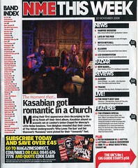
Contents Page Of NME Magazine


This contents page stands out quite alot as it has a plain white background with black text. The image saying Albums of 2009 draws the readers attention to the page as the image as big bold black text. The main focus of this magazine issue will be Albums of 2009.
The text is on the left and right hand side of the image.
At the bottom of the page it says that readers can subscribe to the magazine and save over £45. The text is in bold writing which is in yellow, the publisher will want to make this stand out as they will want readers to subscribe to the magazine.
The masthead of this page is the title of the magazine and the title "This Week".
The left hand side of the page includes the Band Index, which readers can easily read if it interests them.
The red arrow indicates that if the reader wants to read about the UK's No1 gig guide starts on page 58. The reader can go straight to the page they want to read about.

Thursday, 19 November 2009

Contents Page of NME Magazine


NME contents page includes images of oasis on tour and gives a band index. Graphics is used to make the band index stand out by putting the text in a red box. The colours used are the same as the front cover, black, white and red. The masthead title piece of the contents page is the name of the magazine which is NME.
What stands out to me is the bold text saying "This Week". Also the subheading "...Oasis kicked off their world tour" this will appeal to readers who are fans of Oasis, the magazine will probably focus on Oasis and their world tour.
The contents page also includes recent news about music and reviews which readers will find interesting as they can found out reviews about bands, solo artists etc. At the bottom of the page there is a "Subscribe today save 33%" this tries to get the reader to subscribe for monthly issues of NME, offering a saving of 33% will also appeal to the reader as they will save money, this tries to get more readers to read NME and to subscribe.
The size of most of the text is small, this just gives the reader a taste of the magazine and so they can fit everything that is included in the magazine onto the contents page. The layout of this contents page is like a scrabble book, it is not set out formally, this shows that the magazine is focussed at rebellious teenagers.


Contents Page of Q Magazine


The contents page of Q magazine uses the same colours as the front page red, black and white.
The text is on the left hand side of an image of Oasis.
The date that the magazine was published is feautured at the top right of the page. The contents page focuses on Oasis, it mentions that there is an "Oasis Special". As in NME, Q also has a review but its only special review.
The contents page also includes what is in each monthly issue such as Q mail, subscribtions, crosswords and ten commandments.
The colurs are not bright so the page doesnt stand out but it tells the reader the information they want to know about whats in the magazine.