Monday 30 November 2009

Contents Page Of NME Magazine


This contents page stands out quite alot as it has a plain white background with black text. The image saying Albums of 2009 draws the readers attention to the page as the image as big bold black text. The main focus of this magazine issue will be Albums of 2009.
The text is on the left and right hand side of the image.
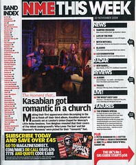
At the bottom of the page it says that readers can subscribe to the magazine and save over £45. The text is in bold writing which is in yellow, the publisher will want to make this stand out as they will want readers to subscribe to the magazine.
The masthead of this page is the title of the magazine and the title "This Week".
The left hand side of the page includes the Band Index, which readers can easily read if it interests them.
The red arrow indicates that if the reader wants to read about the UK's No1 gig guide starts on page 58. The reader can go straight to the page they want to read about.

Thursday 19 November 2009

Contents Page of NME Magazine


NME contents page includes images of oasis on tour and gives a band index. Graphics is used to make the band index stand out by putting the text in a red box. The colours used are the same as the front cover, black, white and red. The masthead title piece of the contents page is the name of the magazine which is NME.
What stands out to me is the bold text saying "This Week". Also the subheading "...Oasis kicked off their world tour" this will appeal to readers who are fans of Oasis, the magazine will probably focus on Oasis and their world tour.
The contents page also includes recent news about music and reviews which readers will find interesting as they can found out reviews about bands, solo artists etc. At the bottom of the page there is a "Subscribe today save 33%" this tries to get the reader to subscribe for monthly issues of NME, offering a saving of 33% will also appeal to the reader as they will save money, this tries to get more readers to read NME and to subscribe.
The size of most of the text is small, this just gives the reader a taste of the magazine and so they can fit everything that is included in the magazine onto the contents page. The layout of this contents page is like a scrabble book, it is not set out formally, this shows that the magazine is focussed at rebellious teenagers.


Contents Page of Q Magazine


The contents page of Q magazine uses the same colours as the front page red, black and white.
The text is on the left hand side of an image of Oasis.
The date that the magazine was published is feautured at the top right of the page. The contents page focuses on Oasis, it mentions that there is an "Oasis Special". As in NME, Q also has a review but its only special review.
The contents page also includes what is in each monthly issue such as Q mail, subscribtions, crosswords and ten commandments.
The colurs are not bright so the page doesnt stand out but it tells the reader the information they want to know about whats in the magazine.

Friday 13 November 2009

Front Cover of Vibe Magazine


Different music magazine front covers all have something different about them for their own individuality so the reader knows which magazine is which. On the front cover of this Vibe magazine the subtitles are not very big and bold, there quite small but still readable to the reader. The colours are not very bright, using the colours red, black and white are colours that catch peoples eyes and stands out. Vibe uses a large image of Eminem in the middle of the page, this image would interest readers that like Eminem and his music and will be the main focus of the magazine.


On this front cover of Vibe magazine the size of text varies alot, it goes from small to big. The only piece of writing that stands out is the big bold letters in red saying "Eminem comes clean"
The audience of this magazine is for a young audience that likes rap.

Front Cover of Q Magazine


Q magazine is one of the most popular music magazine's produced. The writing stands out on this cover as it is big and bold and in red. Q magazine is based on heavier rock music so the audience for this magazine is for older generations but maybe younger people if they are interested in the music. Aswell as Q being a magazine it is also a television channel and hosts yearly award ceremonies and is also a radio station so this will increase the publicity of the magazine.
Using Madonna as the main image of this front cover appeals to more older generations as Madonna and her music appeals to older generations as she has been in the music business for many years.
The ideology of this magazine is the name which is Q, the publisher of this magazine is Paul Rees.
It is very important that every issue of Q magazine focuses on the same audience each month when it is published.
The cover of this page uses simple colours such as red, black, white and blue these colours are subtle colours.
Q magazine offers the reader a 70 page special, this will appeal to readers and will make people want to buy it more as you get an extra 70 free pages so it will make the magazine more popular and it will make more money. Each issue of Q can change their audience by choosing different images, they could either get an image of an old band which would appeal to readers of older generations but Q likes to focus their magazine on younger generations.

Thursday 5 November 2009

Front Cover of NME Magazine


Music Magazines always inlcude images of music artists to show the reader what the magazine is all about. The front cover usually has big bold text which stands out and also has subtitles so the reader knows whats in the magazine. The front cover is also using the colours red black and white, these colours are colours which catch people's attention. The colour red attracts peoples vision to the page and can also be suggested as danger. Using the colour black draws the readers attention to the page as it is bold. Using the colour white with black always makes the text of the writing stand out.
The subtitles of a front cover need to be issues which will attract readers because they want to know the full story. The subtitles can't give too much of the story away or else there would be no point in telling the story inside the magazine.
Front covers are very important, the front cover is the main attraction for readers to buy, if the front cover is just plain and boring then this won't attract reader's to buy it.
The institution of this magazine is NME.
The audience that this magazine aims at is 16+ music lovers, mainly males. The image of Lily Allen is the main focus of this magazine as there is a full image of her covering the front page. The text in yellow stands out to readers as the colour yellow is bright. At the botom of the page it includes extras the magazine has inside with a red background and white text.

Key Concepts LIIAR

L anguage - language that is used in media
I nstitution - the producer e.g BBC, ITV
I deology - a set of aims and ideas
A udience - who it is aimed at
R epresentation - how the character is represented

Monday 2 November 2009

The Brief - Main Task

Main task : the front page, contents and double page spread of a new music magazine. All images and text used must be original, produced by you - minimum of four images.

Presentation of your work
The presentation of the research, planning and evaluation may take the form of any one, or combination of two or more, of the following:
  • a presentation using slideshow software such as powerpoint
  • a blog
  • a podcast;